Tag Advisories
Brand identity and website for TAG Distribution's first digital platform — from logo and design system through to a production Webflow build with a dynamic CMS.


The problem
TAG Distribution helps excise-taxed FMCG brands in tobacco, vape and beverages navigate GCC regulation and get to market. High-stakes work where a client is trusting you with compliance exposure. They had no brand and no site, so prospective clients were judging them on expertise they had no way to show.
I started with a research phase, looking at the firms they'd be measured against. RAQAM has the authority. Serif type, dense report-like sections, awards and regional maps, all of it signalling regulatory precision. But the site is static, with no movement and no route through it, so a visitor arrives and has no idea where to start. Imagine FMCG is the opposite. Clean, confident, easy to scan, and completely flat. Stock imagery, no conversion cues, informative rather than actionable.
Neither one converts. One has credibility with no journey, the other has clarity with no depth. The gap was a site that could carry compliance-grade authority and still guide someone to a conversation.


Rules
Regulated categories. Tobacco, vape and excise-taxed goods. Every claim about services and compliance had to be accurate before it could be persuasive, and the visual language had to signal precision rather than promotion.
No existing brand. No logo, no palette, no type, no assets. Identity and platform had to be built together so the system held from a favicon through to a 36-page site.
Mobile first, not mobile also. 62% of traffic browses on mobile. Every layout decision was made at the small size and scaled up, not the reverse.
Lead quality over lead volume. A consultation with a brand that isn't a fit costs the team more than it earns. The site had to filter, not just capture.
Webflow with a dynamic CMS. The team needed to publish new services and industry pages themselves, without a developer.
Identity and structure
The mark is a set of chips arranged into a circle. Many separate services, each with its own regulatory path, resolving into one system. It holds at favicon size and scales up as a structural device across the site.
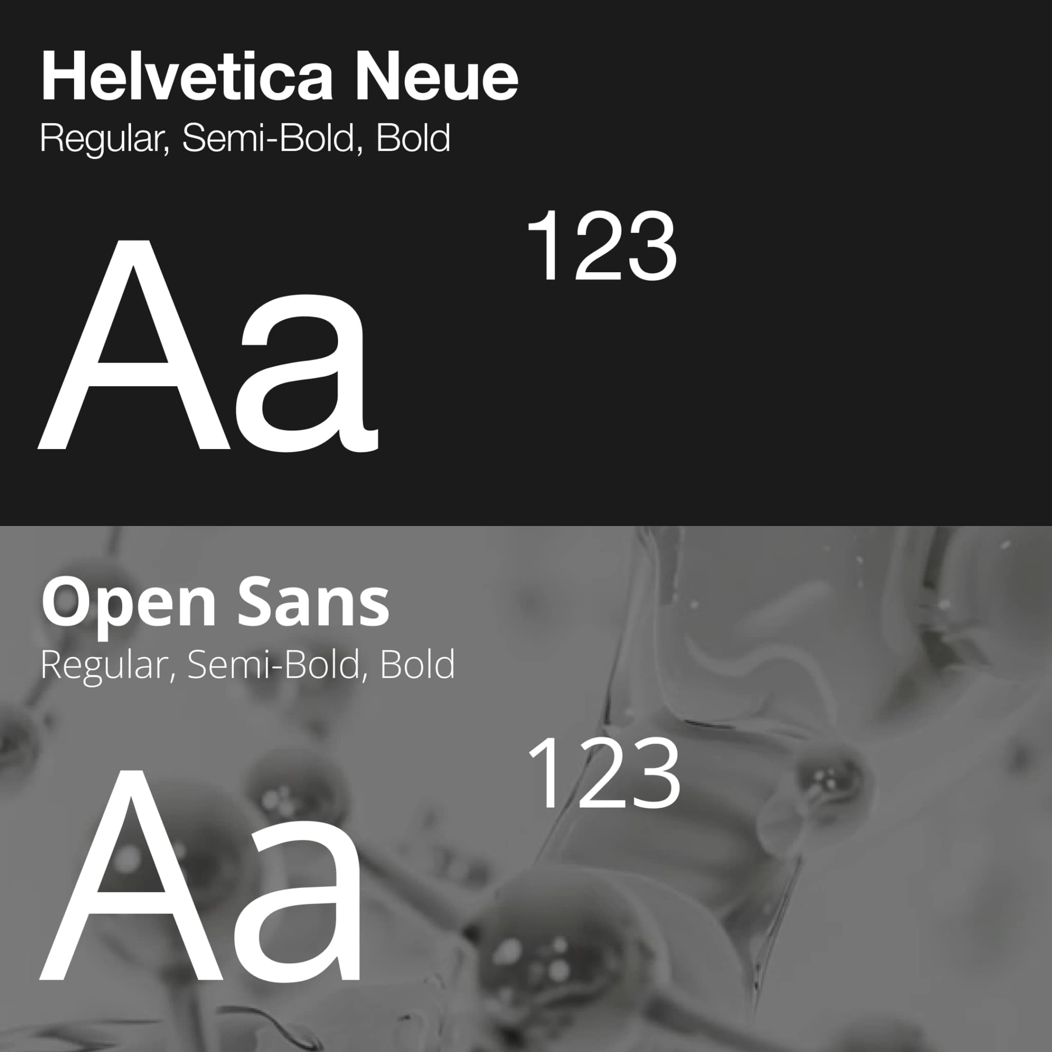
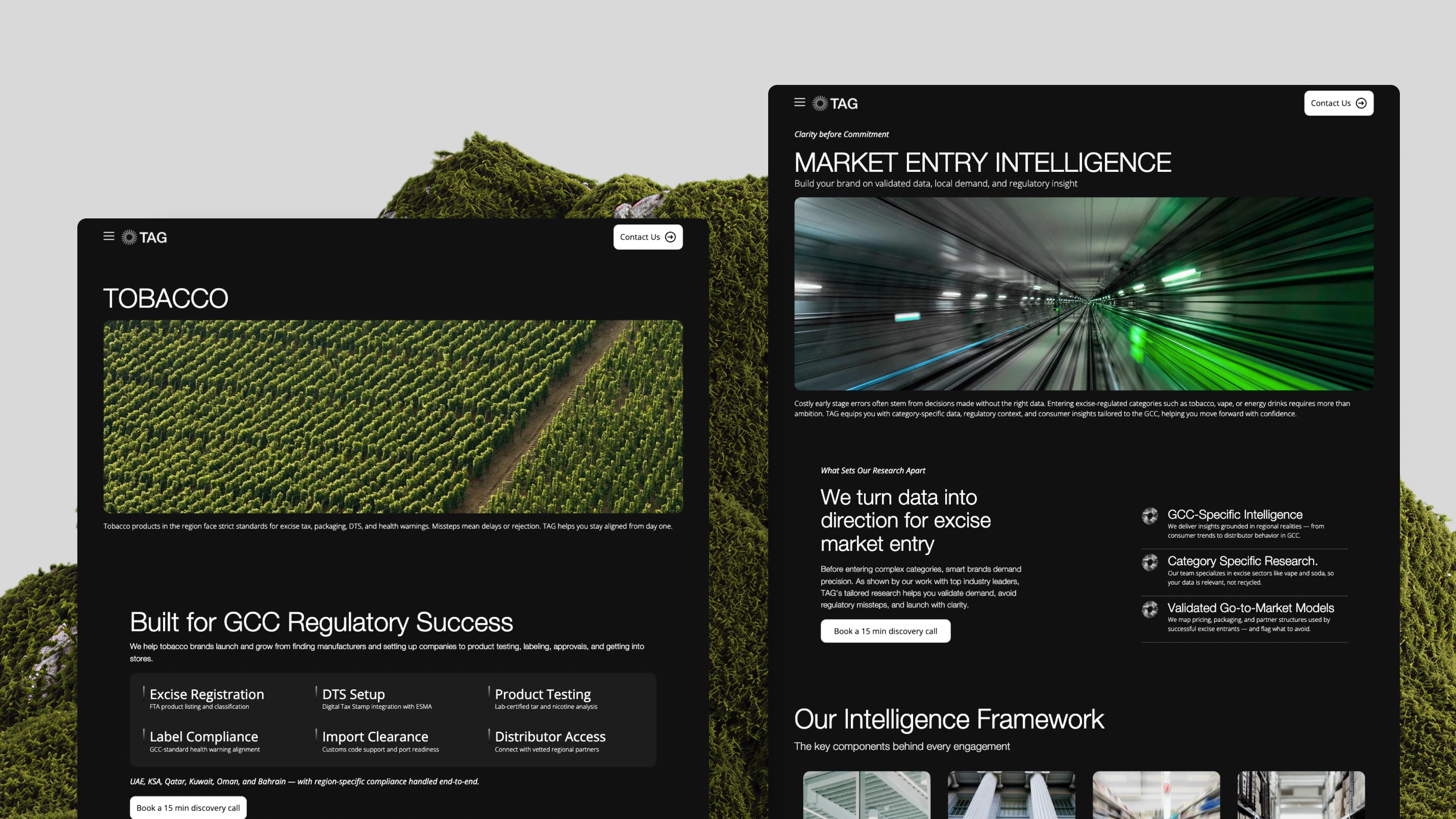
The client asked for a dark theme, which is unusual for a consultancy. They wanted something that read modern and matched the brands they work with rather than the sector they operate in. Sharp typography, tight contrast, minimal colour, and a brand kit the team could apply themselves.
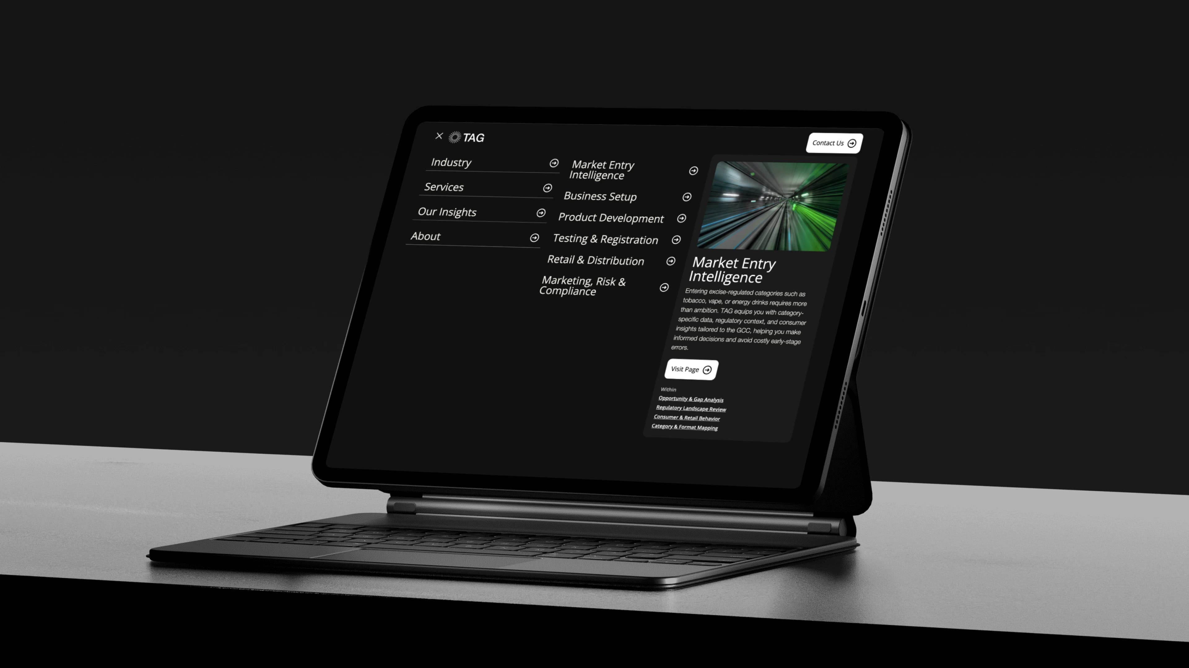
The research pointed to visitors arriving at four different levels of awareness, and the structure is built around that. Someone who has never heard of TAG lands on a homepage that states plainly which industries they serve and what the process is from registration to distribution. Someone who knows they have a regulatory problem but not what to do about it gets industry pages and low-commitment entry points. Someone comparing options gets process detail and proof. Someone ready to act gets a qualification questionnaire instead of a long form, filtering by brand stage, intent and fit, so the enquiry that reaches the team is already the right shape.
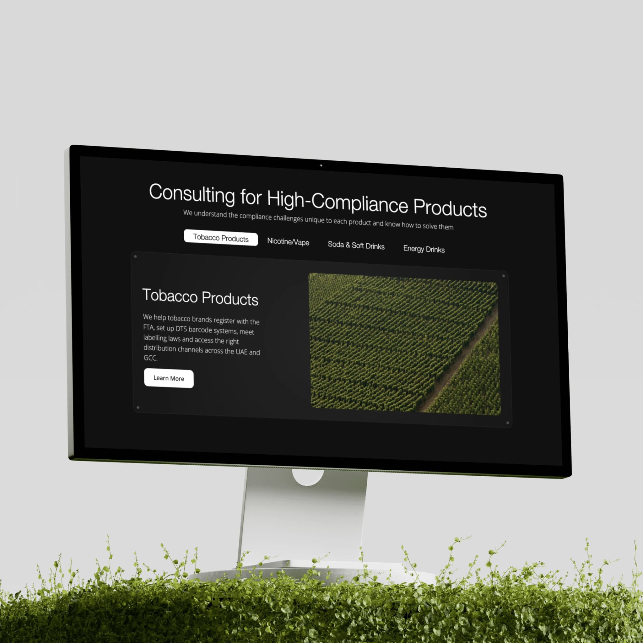
Vertical matters too. A tobacco brand and a soft drinks brand have different regulatory paths, so each service and sub-service has its own page rather than collapsing into one generic services section.
The hardest decision
The client wanted a dark theme, and they were right that it set them apart in a sector that all looks the same. But the site also needed the content depth of a large consultancy: services, sub-services, each with its own page, the structure Deloitte and KPMG run. Dark and long-form regulatory reading are not natural partners, and getting it wrong would have made the site look impressive and go unread.
I kept the dark and solved it in the typography and pacing. Content reveals in sequence on scroll rather than landing as a wall, so a visitor moves through a service at the speed they can absorb it. It carries the client's aesthetic and still works as a reference site someone reads properly before a six-figure decision.
Outcome
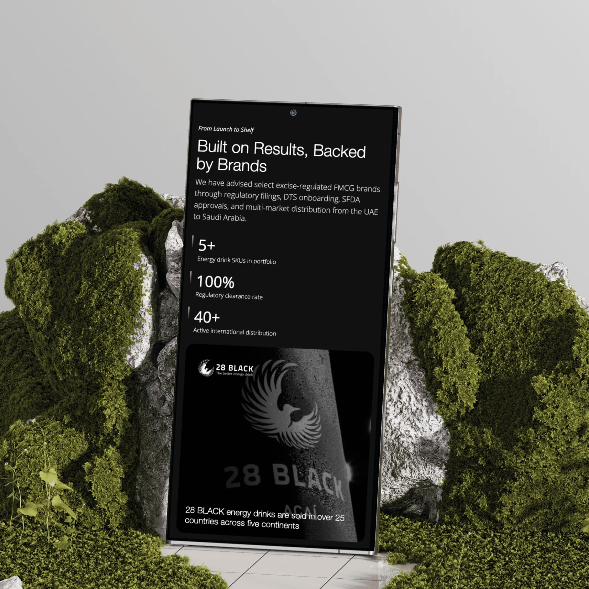
36 pages shipped, all key pages loading under 1.2 seconds. Inbound consultation requests rose 52% after launch, 4.3x within the first eight weeks, and 67% of inbound leads now arrive pre-qualified through the questionnaire. The team publishes new services and industry pages through the CMS without a developer.
Ahmed Ali
Founder – TAG Distribution
“Moved fast without compromising on quality. The whole process felt smooth, collaborative and genuinely enjoyable. If you're looking to grow or do something fresh, they're the team you want in your corner.”