s& Associates
A full brand and website for a UK accountancy firm serving SMEs and international clients — identity, web design, and Webflow build.

The problem
The client launched s& Associates with 25 years of accountancy experience behind them and no brand, no website and no copy. The site would be the first thing every prospective client saw.
Underneath it was a tension. The site had to be credible enough for someone facing an HMRC penalty on overseas income, and unintimidating enough for a corner shop owner who has never hired an accountant.
I started with a research phase, looking at the firms they'd be judged against and the people they needed to reach. The competitors had all picked a side. Rise Accounting is polished and corporate, built for enterprise clients, and leaves a sole trader feeling like they walked into the wrong building. Menzies has authority but dense copy and broad navigation, so a small business owner has to work for a fast answer. Osome is warm and genuinely approachable, but reads casual enough to undercut the authority their international work needs. Nobody was sitting in the middle, and that gap was the brief.


Rules
Regulated copy. No copy existed. Accountancy claims are held to a higher standard, so accreditation, qualifications and service descriptions had to be accurate before they could be persuasive.
No imagery. No photography of the client, their team or their customers. Every image had to be sourced or produced to represent the kind of business they work with.
The client is the brand. A one-person practice competing with firms. Trust had to be human-led, not firm-led.
Webflow. Chosen so the client and their team can update services and content through the CMS without a developer.
Identity and structure
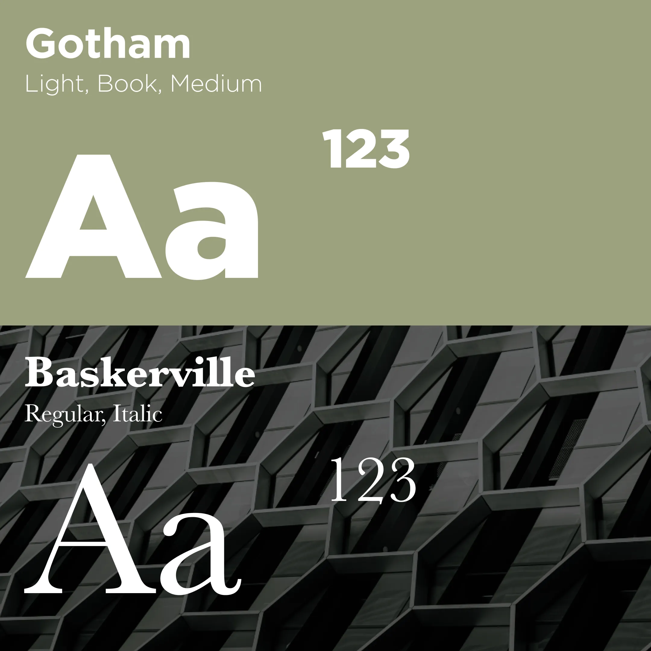
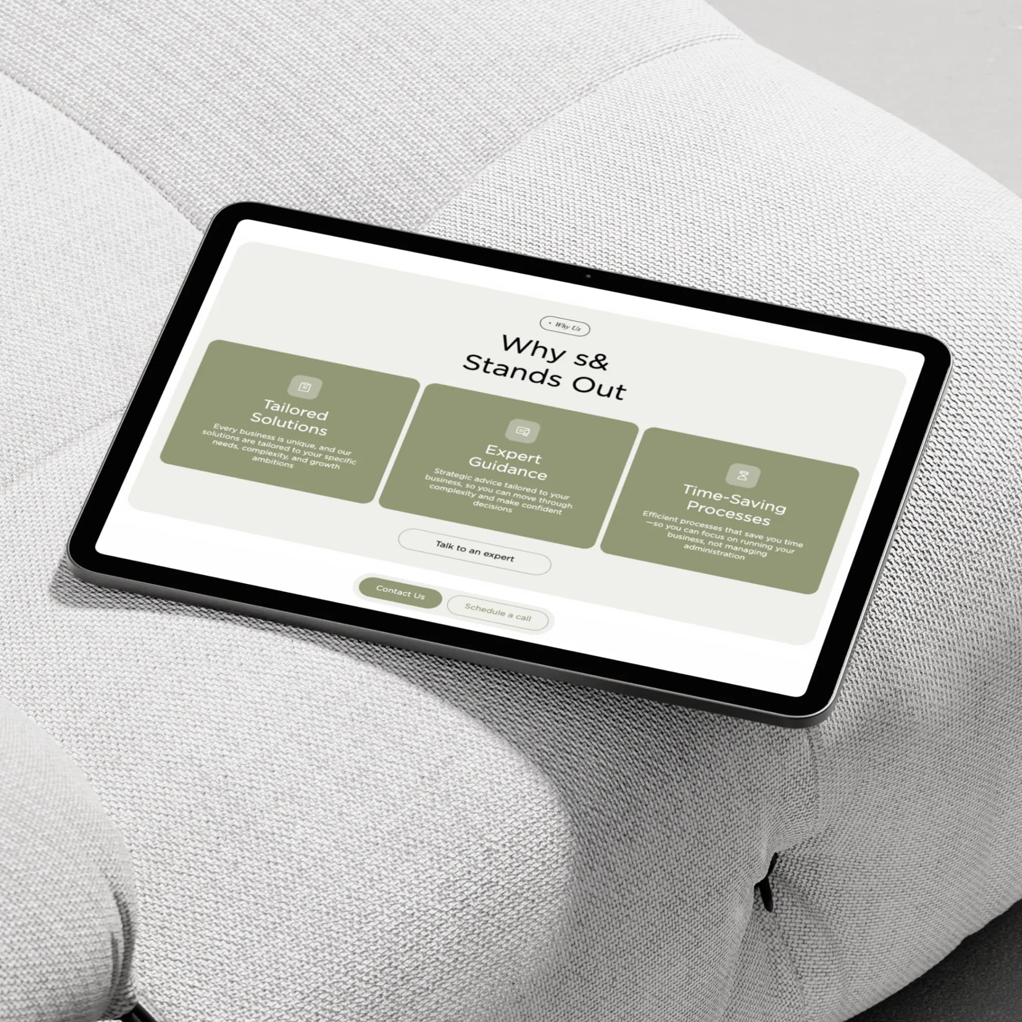
A four-part geometric mark, a calm palette and clean typography. Formal enough for a letterhead and an HMRC submission, simple enough to hold at favicon size. No jargon, generous space, imagery of real working businesses rather than boardrooms.
The research pointed to three audiences arriving on the same homepage with different anxieties. Local business owners and sole traders are around 70% of traffic and want plain English, clear qualifications and a consultation one click away. Founders and finance leads at scaling SMEs read methodology before they book anything. Expats and non-residents arrive already anxious, having read HMRC guidance, and convert on credentials and a clear step-by-step process.
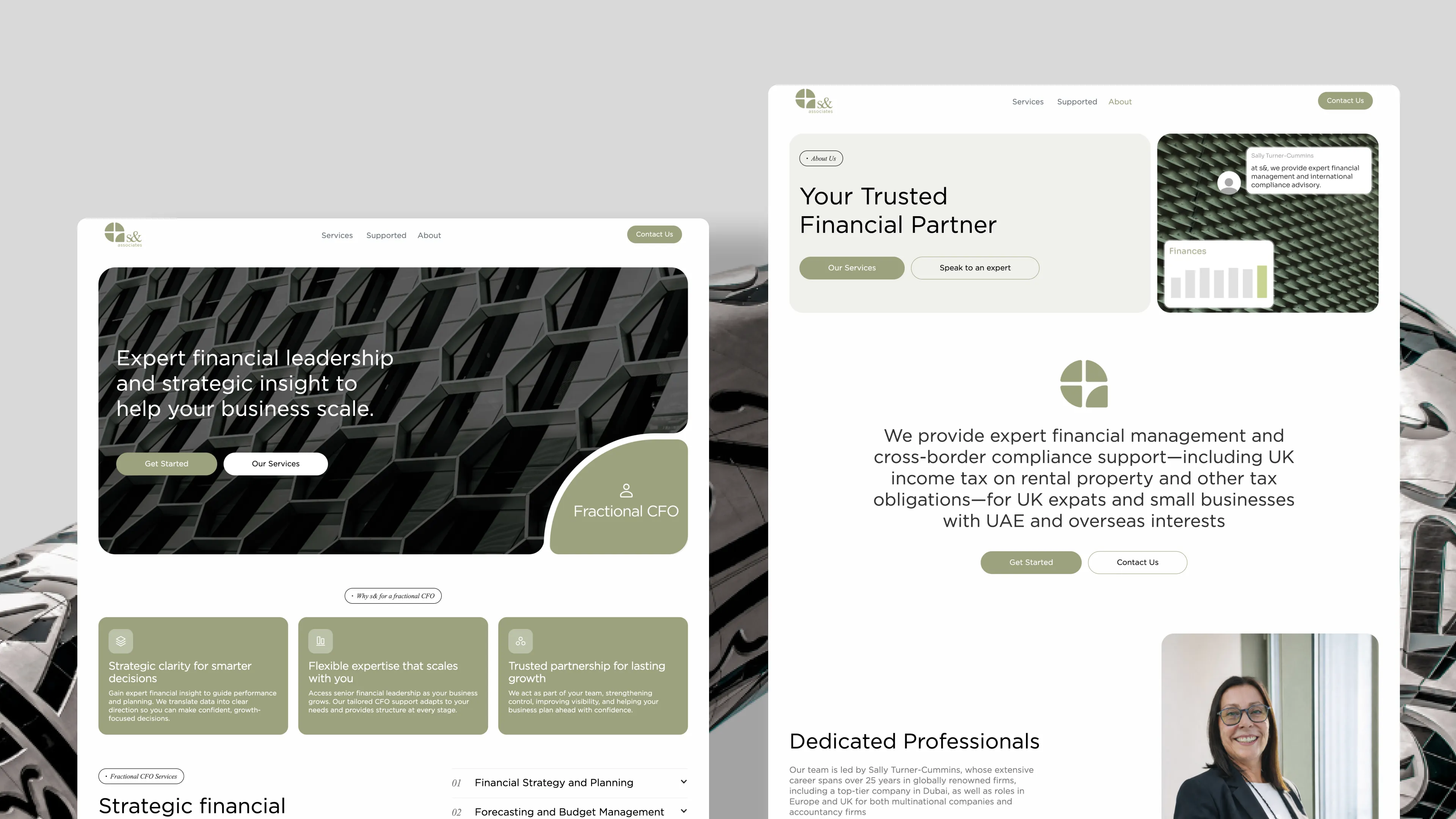
So the structure gives each of them a route to the same action, a free consultation. High-intent visitors go straight from the homepage service tabs to a service page. Unsure visitors find their own business type first through "Businesses we support," then the service. Skeptical or first-time visitors read the client's background, 25 years across Dubai and the UK, before anything else.
Where it went wrong
The client signed off the design. Late in the build, looking at it finished, it had drifted too far toward the corporate end. Credible, but intimidating for the 70% of their audience who are local and small. Exactly the failure we'd identified in Rise at the start.
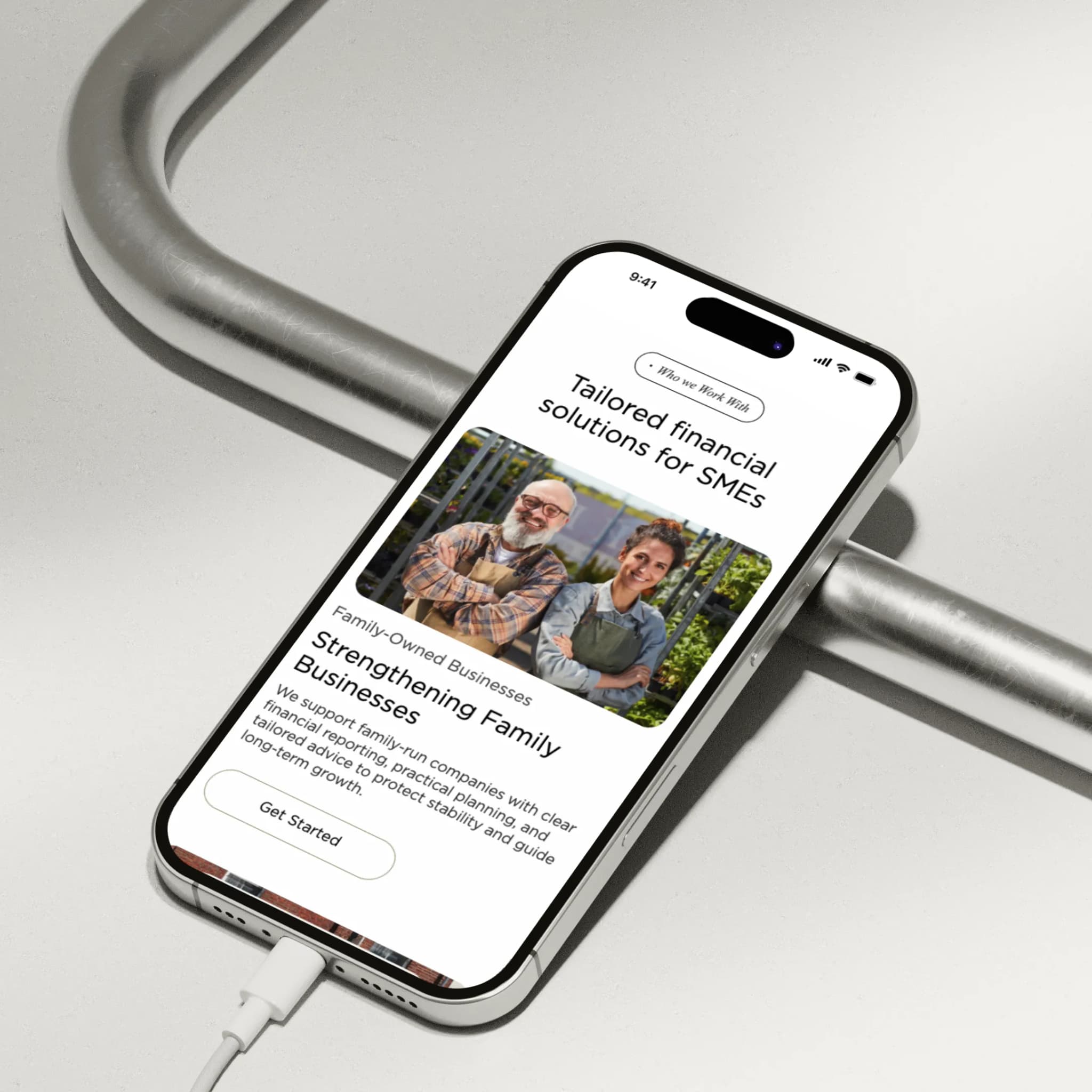
The fix was imagery, not layout. Polished commercial and office photography was replaced with real working environments, independent shops and people at their own counters. Typography, spacing and palette stayed. The professionalism came from the system rather than the pictures.
That should have surfaced early, not at the end. On the next project of this type I'd put the visual direction in front of two or three real SME owners before high-fidelity design begins.
Outcome
The client went from no digital presence to a site generating consultation bookings from a mix of local businesses and international clients. The client and their team manage service content through the Webflow CMS with no developer involved.
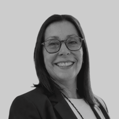
“I really do love it. You guys have done way too much work for me on this and I really appreciate it. The attention to detail has been incredible. I'm recommending you to anybody that needs a website.”