Brillant Capital
A rebuilt digital presence for a Dubai investment firm — a site with a portfolio return calculator and performance tracking, built in Webflow.


The problem
Brillant Capital had the licensing and the track record, on a WordPress template that had outgrown them. It was fine at the start and by this point it looked like every other financial services site, which is a problem for a firm benchmarking itself against platforms like FTMO rather than traditional wealth managers.
Underneath the visual issue was a structural one. The firm runs two businesses: a brokerage with its own trading platform, and fund and portfolio management. Most firms do one or the other. The old site covered the brokerage, didn't connect to the new platform they were building, and barely mentioned portfolio management at all, so half the business was invisible to anyone who landed there.
The two sides also want different things from a visitor. A broker wants a sign-up on the platform. A fund manager wants a conversation. One homepage had to make both legible without either reading as an afterthought.

Rules
Regulated copy. A licensed firm, so every claim about performance and services was written within constraints and reviewed with them before it went live.
Two audiences, one site. Traders looking for a platform and investors looking for a manager, arriving at the same place with different intentions.
Live performance data. Any numbers shown publicly had to come from real executed trades and stay current, which meant infrastructure rather than a design decision.
Webflow, maintained by marketing. The team that runs the site day to day isn't technical, so the build had to be editable by them. We ran training sessions at handover.
Identity and structure
The mark is a rotating globe carrying the firm's B. The B was already theirs, so the work was building something around it that felt distinctly Brillant rather than generic finance. The globe sets the scope of the business and the motion keeps it from reading as static and corporate.
Around it, a system built for the benchmark they were aiming at: restrained, precise, confident. Clarity over decoration, because finance that shouts reads as risk. The interface does the same work, calm and structured rather than loud.
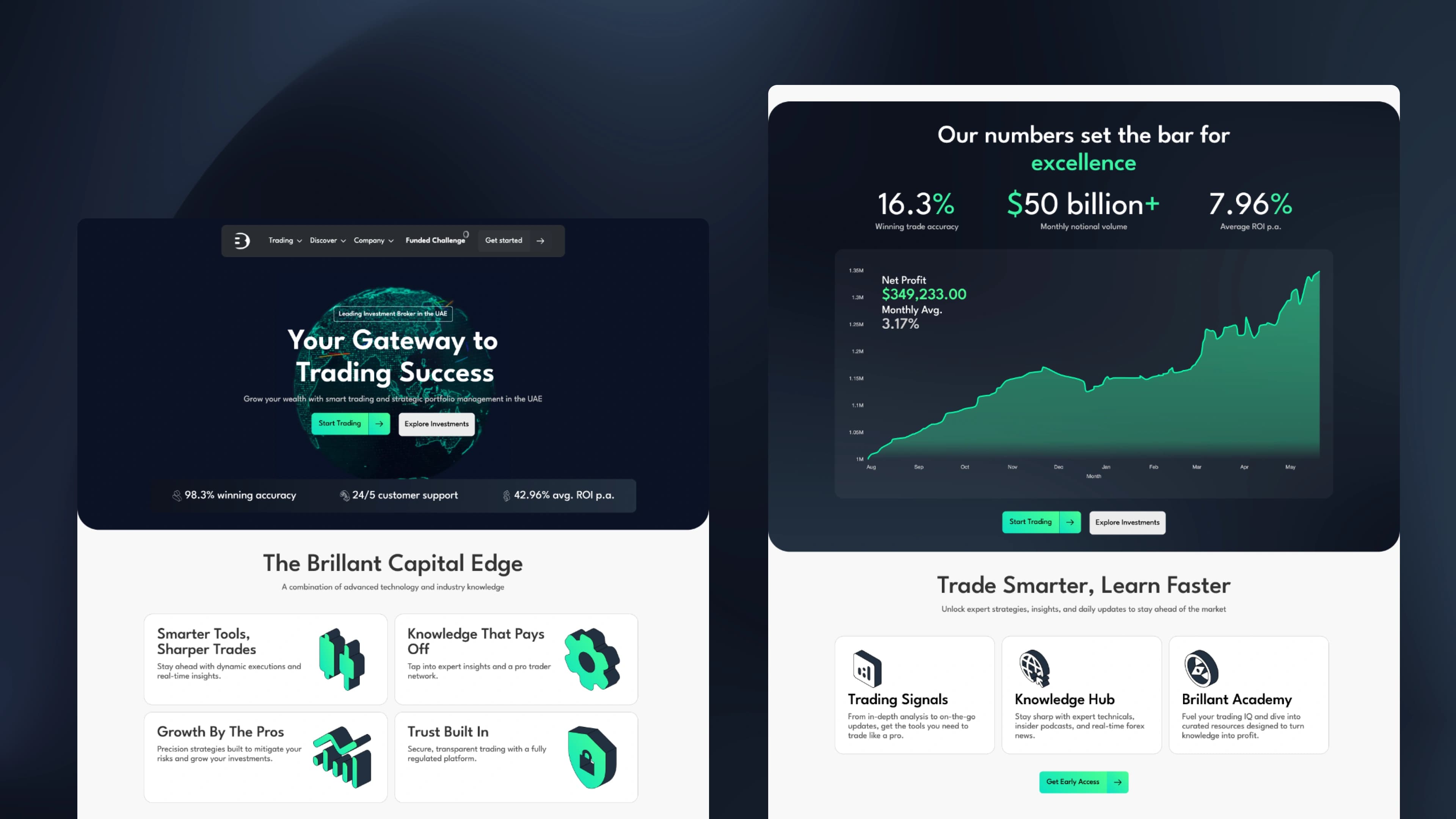
The two business lines are split through the page rather than bolted together. The hero rotates between them so a visitor understands within seconds that the firm does both, then each side gets its own treatment further down with its own route out. Brokerage leads to the platform. Portfolio management leads to a conversation.
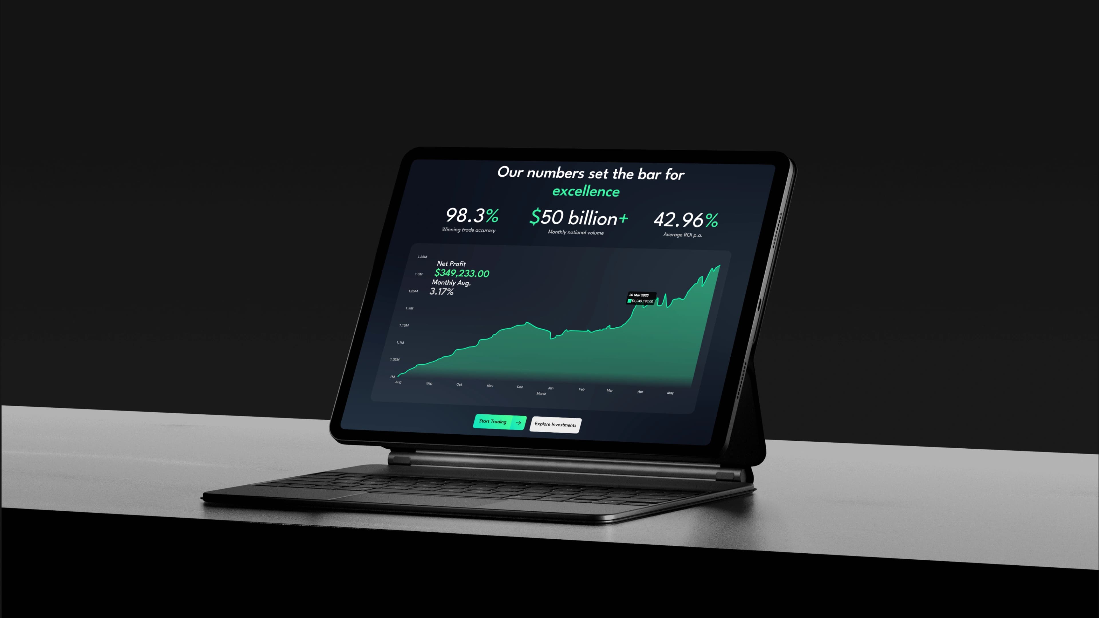
The calculator. A prospective investor enters an amount and sees what that would have returned, calculated from the firm's actual executed trades rather than an illustrative projection. A backend pulls live performance from their system and keeps it current, so the number on the page reflects what the firm is earning for clients now rather than a figure chosen for a brochure.
Webflow doesn't do this on its own. The tool is custom-coded and embedded, with a backend feeding it live data, and it works on mobile.

The hardest decision
Merging the two businesses on one page was the real problem. Separate sites would have been easier and would have split the firm in two, which isn't how they operate. Keeping them together risked a homepage that explained neither.
The identity took longer than anything else, for a related reason. The client wanted something unmistakably theirs, and distinctive in finance usually means loud, which is the one thing a firm handling other people's money cannot afford to be. Several rounds went into finding a mark that was specific to them and still restrained enough to read as trustworthy. The rotating globe was where those two requirements finally met.
Outcome
Qualified leads from organic search rose 42%. Demo sign-ups grew 2.3x in the first month. Form conversion lifted 37%. 17 pages on a dynamic CMS, all key pages loading under a second, maintained by the client's marketing team after training.

“Professional aptitude, how quickly they delivered with that level of excellence. This was my favorite part of working. I recommend services to companies who are trying to do new things.”